
Navigating the Digital Landscape: The Importance of Responsive Web Design in 2024
In today's fast-paced digital world, having a responsive website is no longer just an option; it's a necessity. As we venture further into 2024, the importance of responsive web design continues to grow, driven by evolving technologies, shifting user behaviors, and emerging design trends. In this article, we'll explore why responsive web design remains crucial in 2024, delve into the latest trends, and highlight best practices to ensure your website stays ahead in the digital race.
The Significance of Responsive Web Design
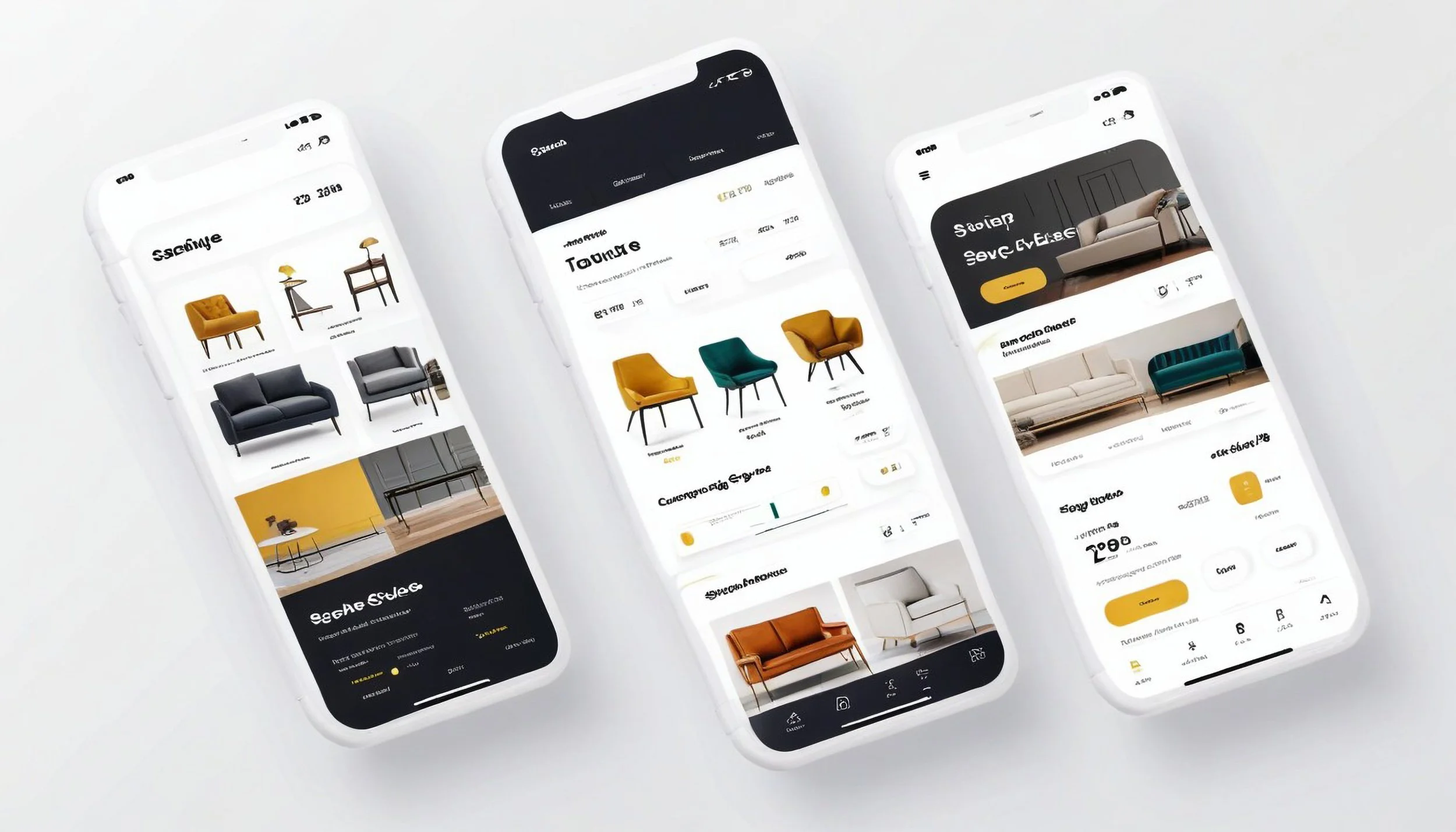
Responsive web design refers to the approach of creating websites that adapt seamlessly to various screen sizes and devices, providing an optimal viewing and interaction experience for users. With the proliferation of smartphones, tablets, smartwatches, and other connected devices, ensuring your website is responsive has never been more critical.
Enhanced User Experience (UX): In 2024, user experience reigns supreme. A responsive website ensures that visitors can navigate your site effortlessly, regardless of the device they're using. By delivering a consistent and intuitive user experience across all platforms, you can keep users engaged and satisfied, ultimately leading to higher conversion rates and customer retention.
Improved SEO Performance: Search engines like Google prioritize mobile-friendly websites in their rankings. A responsive design not only makes it easier for search engine bots to crawl and index your site but also helps you avoid penalties associated with non-responsive or mobile-unfriendly websites. With mobile-first indexing becoming the norm, a responsive design is crucial for maintaining and improving your SEO performance.
Adaptability to Changing Technologies: With the rapid advancement of technology, new devices and screen sizes are constantly emerging. A responsive website future-proofs your online presence, ensuring that your site remains accessible and functional as technology evolves. Whether it's foldable phones, wearable devices, or larger desktop monitors, responsive design ensures your website looks and performs its best on any device.
Trends in Responsive Web Design for 2024
Staying abreast of the latest trends is essential for keeping your website relevant and engaging. In 2024, several trends are shaping the landscape of responsive web design:
Dark Mode Optimization: With the increasing popularity of dark mode across various platforms, optimizing your website for dark themes is crucial. Implementing dark mode compatibility ensures that your site remains visually appealing and readable, regardless of the user's preferences.
Micro-Interactions: Adding subtle micro-interactions enhances user engagement and provides feedback, making interactions more intuitive and enjoyable. From animated buttons to hover effects, incorporating micro-interactions can elevate the overall user experience on your responsive website.
Minimalist Design: Minimalism continues to dominate the design world in 2024. Embracing clean layouts, ample whitespace, and simple typography helps streamline the user experience and ensures your website remains visually appealing on any device.
Performance Optimization: Speed is paramount in today's digital age. Optimizing your website for performance, including fast load times and smooth animations, is essential for retaining visitors and reducing bounce rates, particularly on mobile devices with slower connections.
Best Practices for Responsive Web Design
While trends come and go, certain best practices stand the test of time:
Mobile-First Approach: Start by designing for mobile devices and then scale up for larger screens. Prioritizing mobile ensures a seamless experience for the majority of users who access the web via smartphones and tablets.
Flexible Grids and Layouts: Use fluid grids and flexible layouts that adapt dynamically to different screen sizes. Avoid fixed-width designs that may not translate well across various devices.
Optimized Images and Media: Optimize images and multimedia content to ensure fast loading times without sacrificing quality. Consider using responsive images and lazy loading techniques to deliver the right assets based on device capabilities and screen resolutions.
Device Testing and Optimization: Test your website across a wide range of devices, browsers, and screen sizes to ensure compatibility and responsiveness. Regularly monitor and analyze user behavior using tools like Google Analytics to identify areas for improvement.
Accessibility and Inclusivity: Make your website accessible to users of all abilities by following accessibility best practices, such as using semantic HTML, providing alternative text for images, and ensuring keyboard navigation support.
In conclusion, responsive web design remains indispensable in 2024, driven by the ever-evolving digital landscape and user expectations. By prioritizing responsive design principles, staying abreast of emerging trends, and adhering to best practices, you can create a website that not only looks stunning but also delivers exceptional user experiences across all devices. As we continue to embrace new technologies and design paradigms, responsive web design will remain a cornerstone of successful digital experiences in the years to come.